
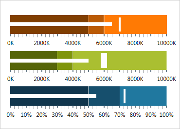
Gráfico de marcadores do WPF
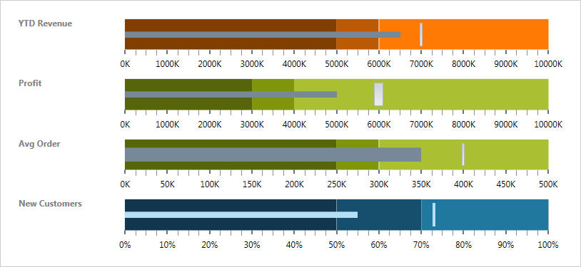
Forneça uma visão simples e concisa dos principais indicadores de desempenho (KPI) que apresente o progresso em direção às metas e faixas boas/melhores/melhores em um espaço horizontal ou vertical mínimo.
Use o novo Ultimate UI do WPF Bullet Graph Configurator para configurar rapidamente o controle e associar dados diretamente do XAML, sem necessidade de código!
BAIXAR exemplos do WPFOrientação e direção configuráveis
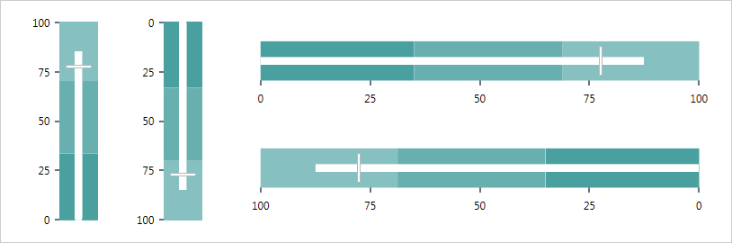
Alterne facilmente entre a orientação horizontal e vertical.
Elementos visuais configuráveis
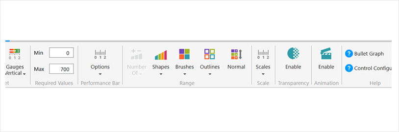
Cada um dos seguintes elementos visuais do gráfico de marcadores pode ser configurado em vários aspectos: barra de desempenho, marcador comparativo, intervalos, marcas de escala, escala, rótulos, borda, plano de fundo e títulos.
Dicas de ferramentas
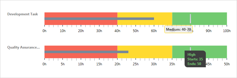
As dicas de ferramentas internas do controle xamBulletGraph mostram os valores da barra de desempenho, o valor de destino ou os valores correspondentes aos diferentes intervalos, respectivamente.
Configurador de gráfico de marcadores
O configurador do Bullet Graph reduz horas do tempo de desenvolvimento, removendo a complexidade de aprender a API do Bullet Graph. Configure visualmente todo o Bullet Graph em uma experiência de apontar e clicar WYSIWYG. Permita que seus designers estilizem controles de forma interativa e visual para obter uma renderização perfeita de pixels de sua intenção de design.
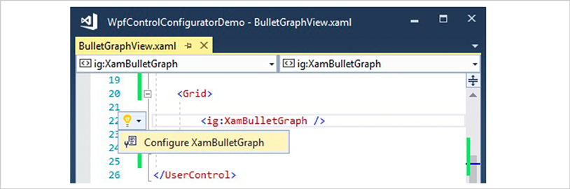
Inicie o Configurador de Gráfico de Marcadores com um único clique
Selecione seu controle no editor XAML e use a lâmpada Ações Sugeridas para iniciar o Configurador de Gráfico de Marcadores.
Configure visualmente seu gráfico de marcadores
Use os itens da Galeria de Faixas de Opções para personalizar visualmente quase todos os aspectos do seu Gráfico de Marcadores – desde a seleção inicial de estilo até as configurações de Forma, Pincéis, Contorno, Escala, Transparência e Animação. Tudo sem precisar saber nada sobre a API do Bullet Graph! Melhor ainda, o configurador lerá todas as alterações feitas no XAML e atualizará as propriedades com nosso analisador XAML completo e bidirecional.
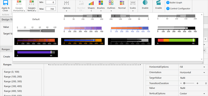
Seleção de estilo Quickset horizontal e vertical
Configure rapidamente seu controle selecionando um dos Quicksets profissionais, lindamente projetados e pré-configurados para um Gráfico de Marcadores Horizontal ou Vertical.
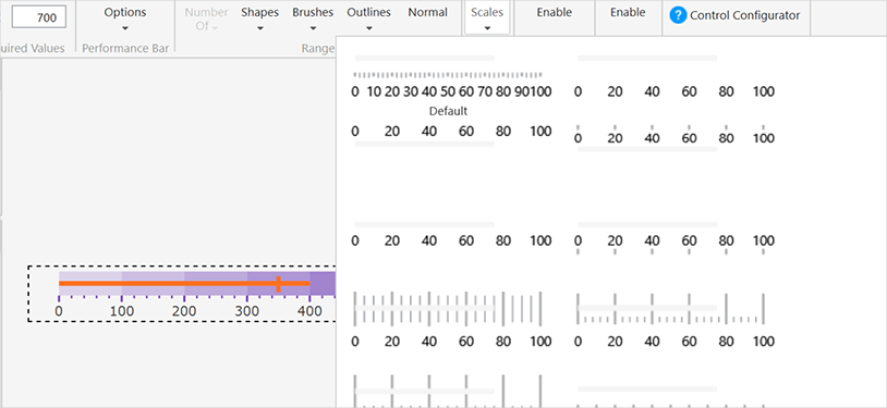
Seletor de Balanças Personalizadas
Escolha uma das personalizações de escala predefinidas avançadas para alterar a aparência da escala do Bullet Graph em seu aplicativo.
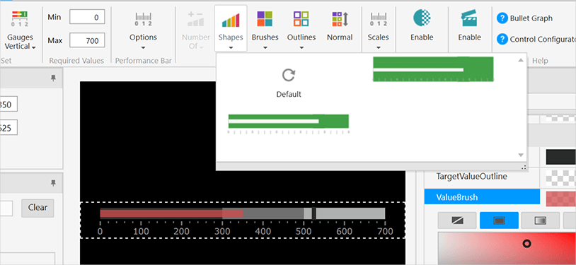
Seletor de formas
Escolha a forma desejada para o estilo Bullet Graph para alterar a forma como o controle é renderizado em seu aplicativo.
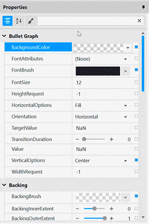
Edição de propriedades com facilidade
Encontre convenientemente propriedades agrupadas por recursos relacionados no Editor de propriedades. Os recursos também são ativados ou desativados pela compatibilidade de recursos. Isso permite que você personalize qualquer detalhe do controle e ajuda você a aprender por exemplo, pois você pode ver em tempo real como suas alterações afetam o controle. Selecione um único intervalo para personalizar as propriedades ou selecione vários intervalos para aplicar rapidamente Pincel, Extensões e Contorno como um grupo.
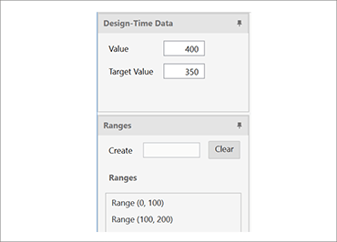
A vinculação de dados é muito fácil
Você pode adicionar rapidamente dados dinâmicos para inflar intervalos no Seletor de intervalo ou pode adicionar dados manualmente no Editor de intervalo e definir o valor da agulha no gráfico de marcadores.
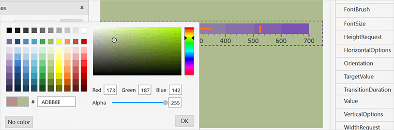
Garantir visualizações de cores corretas
Altere convenientemente o plano de fundo do Configurador de Gráfico de Marcadores para o plano de fundo do aplicativo para que você saiba como será a aparência do controle em tempo de execução. Também incluímos uma linha pontilhada ao redor dos limites de controle reais, para que você saiba onde o controle começa e termina.
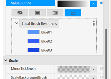
Use facilmente os recursos de estilo existentes
Associe a recursos existentes no nível do projeto ou da página a partir do conveniente Seletor de Recursos.