
Gráfico de dados do WPF
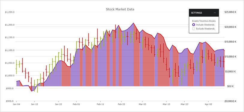
Renderize gráficos do WPF com milhões de pontos de dados que são capazes de atualizações de milissegundos e não poupe nada para atingir uma velocidade incrível. Permita a visualização e análise de dados pesados em grandes volumes de dados com alto desempenho. Um eixo de data/hora aprimorado suporta quebras de eixo, intervalos dinâmicos e rotulagem dinâmica.
BAIXAR exemplos do WPFMais de 75 tipos de gráficos
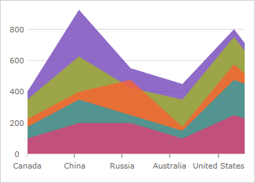
- Série de categorias (Linha, Spline, Coluna, Área, Área de spline, Linha de degrau, Área de degrau, Área de intervalo, Coluna de intervalo, Cascata e nova série de pontos)
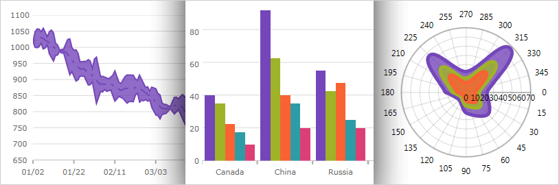
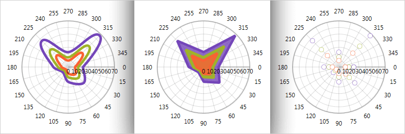
- Série polar (linha polar, área polar, dispersão polar, spline polar, área de spline polar)
- Série Radial (Coluna Radial, Pizza Radial, Área Radial, Linha Radial)
- Série de dispersão (dispersão, linha de dispersão, spline de dispersão, bolha, dispersão de alta densidade, área de dispersão, contorno de dispersão, polilinha de dispersão, polígono de dispersão)
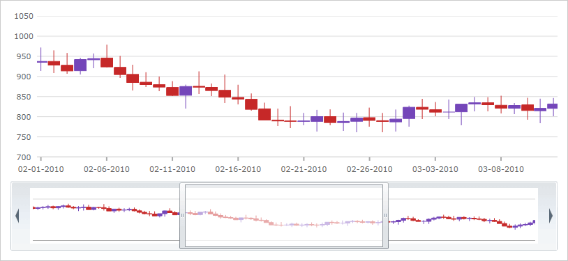
- Série de preços financeiros com castiçal, modos de barra OHLC e muitos indicadores financeiros (por exemplo, EMA, MFI, SMATP, MACD).
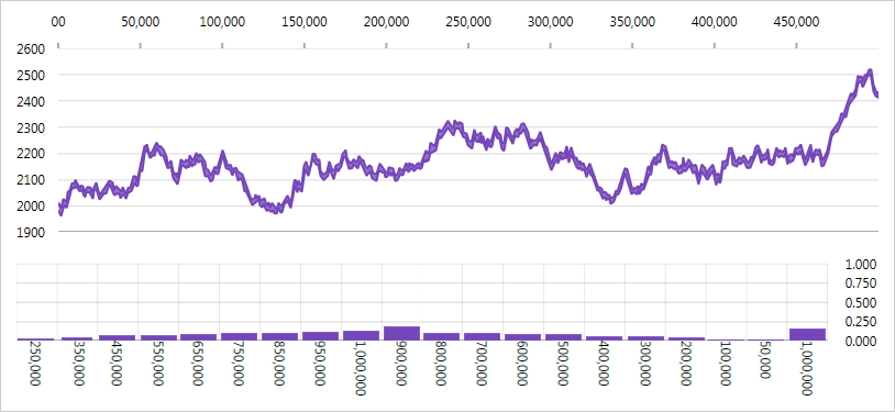
Gráficos em tempo real com milhões de pontos de dados
Com esta versão, a velocidade e o desempenho do nosso Data Chart foram significativamente aprimorados. Este gráfico exibirá milhões de pontos de dados e se atualizará a cada poucos milissegundos para lidar com seus feeds em tempo real.
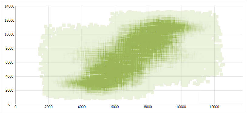
Série de dispersão de alta densidade
Vincule e mostre dados de dispersão que variam de milhares a milhões de pontos de dados sem sacrificar o desempenho. Altere a resolução da série para ajustar o nível de desempenho da renderização ao lidar com grandes quantidades de pontos de dados no gráfico.
Interações de foco
Ative várias interações ao passar o mouse sobre a série de dados do gráfico usando o mouse ou gestos de toque. Essas interações de foco podem exibir miras ou realces de barra/coluna para ajustar aos pontos de dados reais. Anexe dicas de ferramentas às interações de foco e bloqueie-as em miras ou eixos.
Modular Design
O controle de gráfico de dados do WPF foi projetado para modularidade de eixos e séries de gráficos. Vários eixos e várias séries de gráficos são suportados.
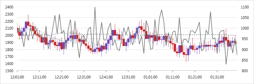
Gráficos financeiros
Cenários de gráficos financeiros, com suporte para gráficos de barras Candlestick e OHLC, e muitos indicadores técnicos integrados (como Médias Móveis, Bandas de Bollinger, Índice de Fluxo de Dinheiro, MACD, RSI de Wilder) são suportados.
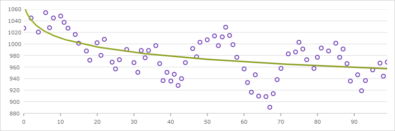
Linhas de tendência
Suporte para vários tipos, incluindo linhas de tendência linear (x), quadrática (x2), cúbica (x3), quártica (x4), quíntica (x5), logarítmica (logn x), exponencial (ex) e lei de potência (axk + o(xk)).
Panorâmica e zoom interativos
Use o teclado, a barra de zoom, a roda do mouse ou arraste e selecione qualquer região retangular com o mouse para aumentar o zoom e ver de perto os pontos de dados. Quando você pode mostrar milhões de pontos de dados, os pontos individuais perdem sua identidade quando completamente reduzidos.
Gráficos Científicos
As séries polares fornecem informações sobre dados científicos.
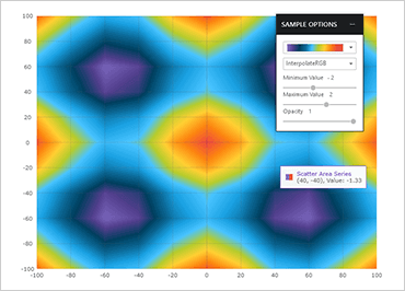
Série de áreas de dispersão
A série de áreas de dispersão desenha uma superfície colorida, em um contexto cartesiano, com base em uma triangulação de coordenadas X e Y com um valor numérico atribuído a cada pixel da superfície. Você pode usar esta série para plotar dados científicos, como força do campo magnético, formas 3D projetadas ou achatadas em um plano 2D ou correlação entre três colunas numéricas em seus dados.
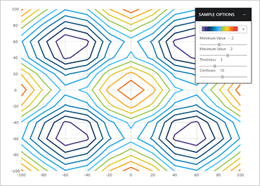
Série de contorno de dispersão
A série de contornos de dispersão pode plotar os mesmos dados que a série de áreas de dispersão, visualizando dados usando linhas de contorno em vez de área de superfície interpolada.
Série de polilinhas de dispersão
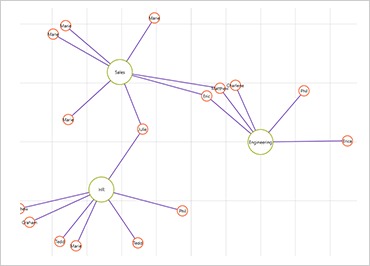
A série Polilinha de dispersão pode plotar contornos de formas personalizadas que são definidas usando uma coleção de coleções de pontos X/Y. A série pode mostrar várias conexões entre pontos de dados para indicar rebaixamentos ou até mesmo construir uma visão das redes.
Série de polígonos de dispersão
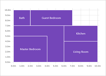
A série de polígonos de dispersão pode plotar formas preenchidas personalizadas que são definidas usando uma coleção de coleções de pontos X/Y. A série pode ser usada para destacar regiões na área de plotagem do gráfico.
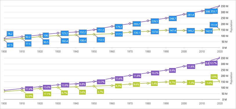
Eixo Data/Hora
O Eixo de Data/Hora é um eixo de tempo aprimorado que dá suporte a quebras, intervalos dinâmicos e rotulagem dinâmica. A coleção Breaks permite que os desenvolvedores configurem o eixo X para omitir datas em um intervalo, como fins de semana ou outros períodos insignificantes. A coleção Intervals facilita a especificação de intervalos de rótulo condicionais com base no intervalo visível do eixo, como rótulos para cada mês em que um ano está visível. Os formatos de etiqueta também podem ser configurados de acordo com a faixa de visibilidade.
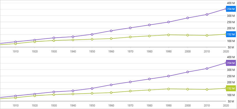
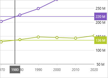
Anotação de valores finais
Mostra o valor do último ponto de dados em sua fonte de dados. Renderiza uma caixa colorida para cada fonte de dados em rótulos do eixo Y.
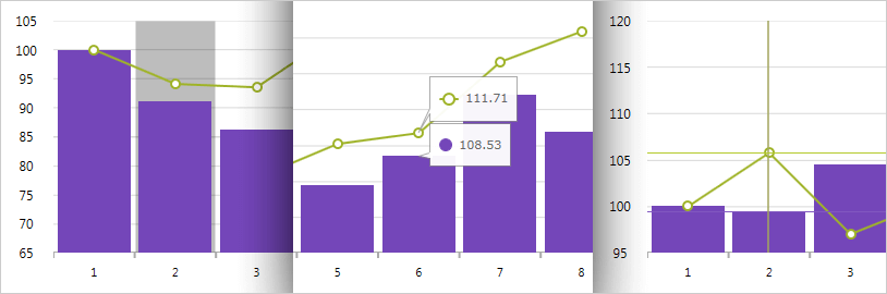
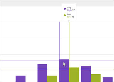
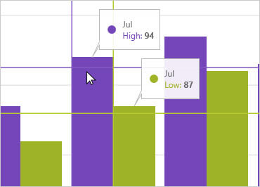
Anotação de mira
Mostra valores de ponto de dados no local do cursor e renderiza esses valores em caixas coloridas sobre rótulos dos eixos X e Y.
Camada de textos explicativos
Anote pontos de dados importantes ou personalize valores em caixas de texto explicativo com base em sua lógica (ou seja, calcule valores máximos em sua fonte de dados).
Camada de dica de ferramenta de categoria
Renderiza uma dica de ferramenta combinada para todas as séries em uma categoria de dados.
Camada de dica de ferramenta do item
Renderiza uma dica de ferramenta individual para cada série em uma categoria de dados.