Web Components Dashboard Tile Overview
The Web Components Dashboard Tile is a automatic data visualization component which determines via analysis of a DataSource collection/array or single data point what would be the most appropriate visualization to display. It then also provides a further suite of tools in its embedded IgcToolbarComponent that let you alter the visualization that is presented in a variety of ways.
A wide variety of visualizations may be selected for display depending on the shape of the provided data including, but not limited to: Category Charts, Radial and Polar Charts, Scatter Charts, Geographic Maps, Radial and Linear Gauges, Financial Charts and Stacked Charts.
Interacting with the chart type menu in the toolbar will allow for selecting a different visualization among the list of likely candidates.
Web Components Dashboard Tile Example
Dependencies
Install the following packages in the Ignite UI for Web Components toolset:
npm install igniteui-webcomponents-charts
npm install igniteui-webcomponents-core
npm install igniteui-webcomponents-dashboards
npm install igniteui-webcomponents-gauges
npm install igniteui-webcomponents-grids
npm install igniteui-webcomponents-inputs
npm install igniteui-webcomponents-layouts
npm install igniteui-webcomponents-maps
The following modules are suggested when using the Dashboard Tile component:
import { IgcDashboardTileModule, IgcDataChartDashboardTileModule, IgcRadialGaugeDashboardTileModule,
         IgcLinearGaugeDashboardTileModule, IgcGeographicMapDashboardTileModule,
         IgcPieChartDashboardTileModule } from "igniteui-angular-dashboards";

ModuleManager.register(
    IgcDataChartDashboardTileModule,
    IgcRadialGaugeDashboardTileModule,
    IgcLinearGaugeDashboardTileModule,
    IgcGeographicMapDashboardTileModule,
    IgcPieChartDashboardTileModule,
    IgcDashboardTileModule
);
Usage
Depending on what you bind the Dashboard Tile's DataSource property to will determine which visualization you see by default, as the control will evaluate the data you bind and then choose a visualization from the Ignite UI for Web Components toolset to show. The data visualization controls that are included to be shown in the Dashboard Tile are the following:
The data visualization that is chosen by default is mainly dependent on the schema and the count of the DataSource that you have bound. For example, if you bind a single numeric value, you will get a IgcRadialGaugeComponent, but if you bind a collection of value-label pairs that are easy to distinguish from each other, you will likely get a XamDataPieChart. If you bind an DataSource that has more value paths, you will receive a IgcDataChartComponent with multiple column series or line series, depending mainly on the count of the collection bound. You can also bind to a ShapeDataSource or data the appears to contain geographic points to receive a IgcGeographicMapComponent.
You are not locked into a single visualization when you bind the DataSource, and you can tell the control that you want to see a particular visualization by setting its VisualizationType property. For example, if you specifically wanted to see a line chart, you could define the Dashboard Tile like so:
The visualization or properties of the visualization are also configurable using the IgcToolbarComponent at the top of the control. This IgcToolbarComponent has the default tools for the current visualization with the addition of four Dashboard Tile specific ones, highlighted below:
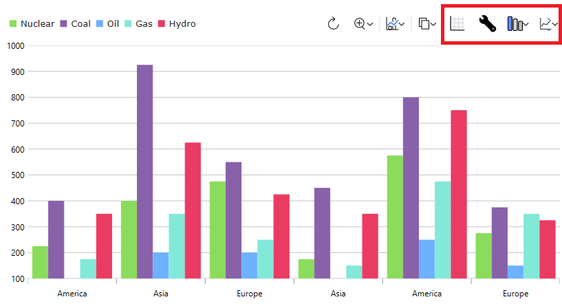
From left to right:
- The first tool will show a data grid with the
DataSourceprovided to the control. This is a toggle tool, so if you click it again after showing the grid, it will revert to the visualization. - The second tool allows you to configure the settings of the current data visualization.
- The third tool allows you to change the current visualization, allowing you to plot a different series type or show a different type of visualization altogether. This can be set on the control by setting the
VisualizationTypeproperty, mentioned above. - The last tool allows you to configure which properties on your underlying data item are included for the control. You can configure this by setting the
includedPropertiesorexcludedPropertiescollection on the control.
This demo demonstrates dashboard tile integration with the Web Components Pie Chart. The toolbar options at the top right provides access to styling and changing the data visualization.
This demo demonstrates dashboard tile integration with the Web Components Geographic Map. The toolbar options at the top right provides access to styling and changing the data visualization.
API References
IgcToolbarComponentIgcCategoryChartComponentIgcDataChartComponentIgcDataPieChartComponentIgcGeographicMapComponentIgcLinearGaugeComponentIgcRadialGaugeComponent