Styling Overview
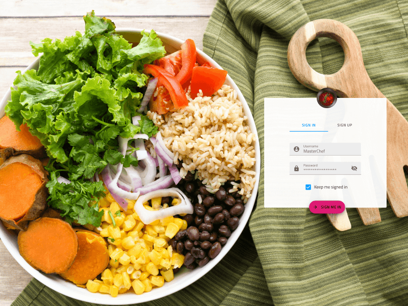
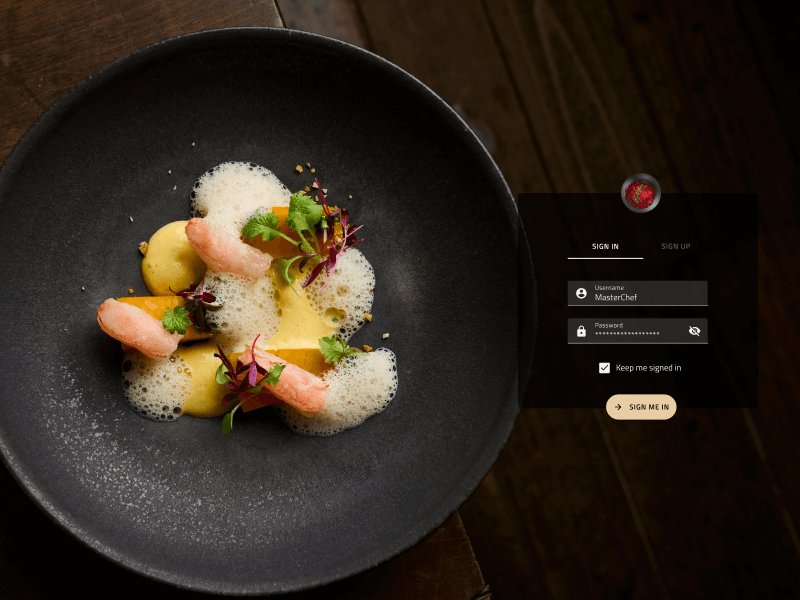
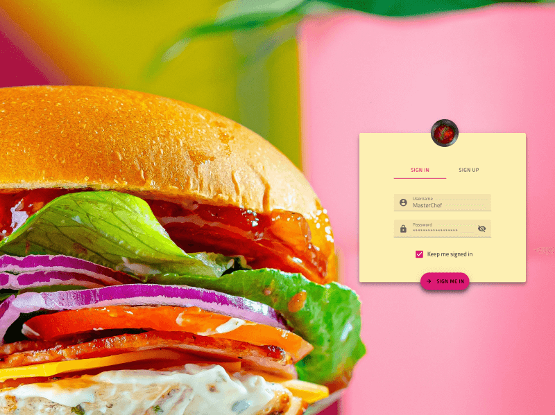
The Indigo.Design System provides elaborate means for styling all 60+ UI components that also map to Ignite UI for Angular controls. The theming engine in our Angular product allows for creating custom color themes that can restyle the whole product in just a few lines of code. The App Builder also implements these theming mechanisms to let users change the complete look of their apps with just a few clicks.
Styling in Figma
Each of the four Figma libraries, Indigo.Design for Material, Indigo.Design for Bootstrap, Indigo.Design for Fluent, and Indigo.Design for Indigo, has the same structure of pages that provide assets and a powerful styling infrastructure upon which the rest of the library is built. So after you pick your variant based on the design language you prefer, head to the following pages to further customize the appearance of your library:
- ↳ Icons
- ↳ Colors
- ↳ Typography
- ↳ Elevation
- ↳ Illustrations
The listed pages are located under the 🧱 Foundation page. Тhe Colors and Elevations exist as Color styles and Effect styles, while Typography is defined as Text styles, which allows you to quickly change the theme for any given design we have created with the Indigo.Design System.
To find more:
- Material Icons - a collection of 160+ Material Icons extended with 360+ more icons created by us according to the Material icon design guidelines, which you can easily extend even further
- Colors - palettes with primary, secondary and gray color variants, as well as special colors and a couple of palettes specifically designed for data visualizations, including a set optimized for different types of color blindness
- Typography - a collection of generic and component-specific text styles
- Elevation - the set of 24 shadows we are familiar with from Material Design
- Illustrations - a set of 17 customizable and stylable illustrations to make your designs more playful and complete
Additional Resources
Related topics:
Our community is active and always welcoming to new ideas.
 GitHub