Button
Use the Button Component to represent the trigger for a simple action that the user can take. Buttons are used in cards, dialogs, forms, and many other components and patterns. The Button is visually identical to the Ignite UI for Angular Button Component
Button Demo
Type
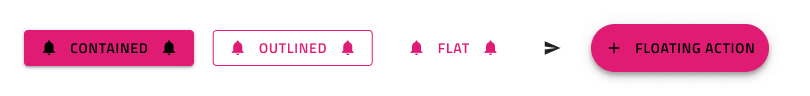
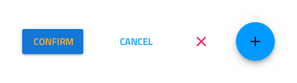
Five types of Buttons are supported:
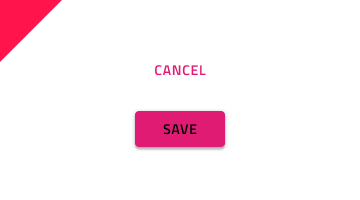
- A more prominent Contained Button with color fill and shadow that emphasizes an action.
- A less prominent Outlined Button with color outline appropriate for the majority of actions.
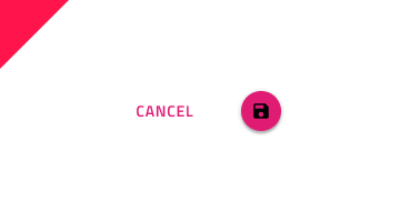
- A very subtle Flat Button that is typically used for the least important actions.
- A very prominent Floating Action Button (Fab) with color fill and shadow that is used once per screen to strongly emphasize the main action.
- An Icon Button for actions that are represented only with an icon. Icon Buttons can also be Contained, Outlined, Flat and Fab type.
Size
All Button types are available in three sizes:
- Large
- Medium
- Small

Interaction States
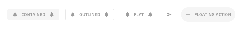
You may also insert each button in a disabled state because they all support both Enabled and Disabled variants. In Figma you can switch between the two using a boolean operation from the properties panel.
States
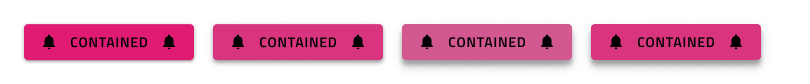
In Figma the Enabled buttons support Idle, Hover, Focused and Focused & Hover states which can be switched between by changing the State property.
Layout Template
Contained, Outlined, Flat, and Floating Action Buttons support flexible icon and label templates. In Figma, to show or hide the icons, you can use the Left Icon and Right Icon boolean properties. If you want to have an Icon Button, you can set the Content property to Icon.

Styling
The Buttons come with styling flexibility through the various options for the background, label, and icon colors.
Usage
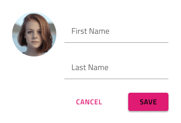
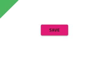
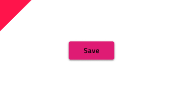
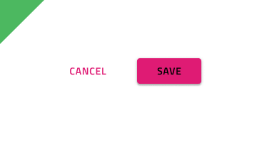
When the content of a Button contains a label, it must be uppercase and with a thicker (usually Medium or Semi-bold) font treatment. When more than one Button is needed for a layout, size them with equal height and arrange them on the same horizontal plane next to each other with sufficient space on both sides to avoid erroneous taps and clicks. In such layouts, avoid combining the different types of buttons. Preferably, you'll want to choose one and use it consistently for all actions that belong in that section of the UI.
| Do | Don't |
|---|---|
 |
 |
 |
 |
 |
 |
Additional Resources
Related topics:
Our community is active and always welcoming to new ideas.
 GitHub