Visão geral do componente do chip Angular
The Angular Chip componenté um elemento visual que exibe informações em um recipiente oval. O componente possui várias propriedades – pode ser templateado, excluído e selecionado. Múltiplos chips podem ser reordenados e conectados visualmente entre si, usando a área do chip como um recipiente.
Angular Chip Example
Getting Started with Ignite UI for Angular Chip
Para começar a usar o componente Ignite UI for Angular Chip, primeiro você precisa instalar Ignite UI for Angular. Em um aplicativo Angular existente, digite o seguinte comando:
ng add igniteui-angular
Para obter uma introdução completa ao Ignite UI for Angular, leia o tópico de introdução.
O próximo passo é importar o IgxChipsModule no arquivo app.module.ts:
// app.module.ts

import { IgxChipsModule } from 'igniteui-angular/chips';
// import { IgxChipsModule } from '@infragistics/igniteui-angular'; for licensed package

@NgModule({
    ...
    imports: [..., IgxChipsModule],
    ...
})
export class AppModule {}
Alternativamente,16.0.0 você pode importarIgxChipComponent como uma dependência independente ou usar oIGX_CHIPS_DIRECTIVES token para importar o componente e todos os seus componentes e diretivas de suporte.
// home.component.ts

import { IGX_CHIPS_DIRECTIVES } from 'igniteui-angular/chips';
import { NgFor } from '@angular/common';
// import { IGX_CHIPS_DIRECTIVES } from '@infragistics/igniteui-angular'; for licensed package

@Component({
  selector: 'app-home',
  template: `
    <igx-chip *ngFor="let chip of chipList" [id]="chip.id">
      {{ chip.text }}
    </igx-chip>
  `,
  styleUrls: ['home.component.scss'],
  standalone: true,
  imports: [IGX_CHIPS_DIRECTIVES, NgFor],
})
export class HomeComponent {
  public chipList = [
    { text: 'Country', id: '1', icon: 'place' },
    { text: 'City', id: '2', icon: 'location_city' },
    { text: 'Address', id: '3', icon: 'home' },
    { text: 'Street', id: '4', icon: 'streetview' },
  ];
}
Agora que você importou o módulo ou diretivas Ignite UI for Angular Chips, pode começar a usar oigx-chip componente.
Using the Angular Chip Component
EleIgxChipComponent possui umaid propriedade de entrada para que as diferentes instâncias do chip possam ser facilmente distinguidas. Se umid não for fornecido, ele será gerado automaticamente.
<igx-chip *ngFor="let chip of chipList" [id]="chip.id">
  {{chip.text}}
</igx-chip>
Escolha
A seleção pode ser habilitada definindo aselectable propriedade de entrada paratrue. Ao selecionar um chip, oselectedChanging evento é disparado. Ele fornece o novoselected valor para que você possa obter o novo estado e o eventooriginalEvent original que desencadeou a mudança de seleção. Se isso não for feito por meio da interação do usuário, mas sim definindo aselected propriedade programaticamente, o argumentooriginalEvent tem um valor denull.
<igx-chip *ngFor="let chip of chipList" [selectable]="true">
  <igx-icon igxPrefix>{{chip.icon}}</igx-icon>
  {{chip.text}}
</igx-chip>
Removing

A remoção pode ser ativada definindo aremovable entrada paratrue. Quando ativado, um botão de remover é renderizado no final do chip. Ao remover um chip, oremove evento é emitido.
Por padrão, o chip não é removido automaticamente da árvore DOM ao clicar no ícone remover. A remoção precisa ser feita manualmente.
<igx-chip *ngFor="let chip of chipList" [id]="chip.id" [removable]="true" (remove)="chipRemoved($event)">
  <igx-icon igxPrefix>{{chip.icon}}</igx-icon>
  {{chip.text}}
</igx-chip>
public chipRemoved(event: IBaseChipEventArgs) {
    this.chipList = this.chipList.filter((item) => {
        return item.id !== event.owner.id;
    });
    this.changeDetectionRef.detectChanges();
}
Arrastando
Arrastar pode ser ativado definindo adraggable entrada paratrue. Quando ativado, você pode clicar e arrastar o chip.
<igx-chip *ngFor="let chip of chipList" [id]="chip.id" [draggable]="true">
  <igx-icon igxPrefix>{{chip.icon}}</igx-icon>
  {{chip.text}}
</igx-chip>
Note
Para reordenar os chips, você precisa lidar com o evento usando oIgxChipsAreaComponent.
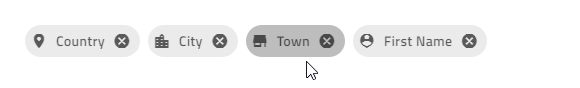
Para criar o exemplo de demonstração, usaremos os recursos acima:
<igx-chip *ngFor="let chip of chipList" [id]="chip.id" [selectable]="true" [removable]="true" (remove)="chipRemoved($event)">
  <igx-icon igxPrefix>{{chip.icon}}</igx-icon>
   {{chip.text}}
</igx-chip>
Então, precisamos adicionar achipList função e que lida com oremove evento:
import { IBaseChipEventArgs } from 'igniteui-angular/chips';
// import { IBaseChipEventArgs } from '@infragistics/igniteui-angular'; for licensed package
...
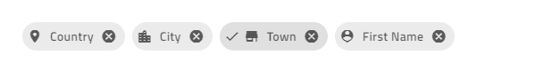
public chipList = [
{
text: 'Country',
id: '1',
icon: 'place'
},
{
text: 'City',
id: '2',
icon: 'location_city'
},
{
text: 'Town',
id: '3',
icon: 'store'
},
{
text: 'First Name',
id: '4',
icon: 'person_pin'
}
];
private changeDetectionRef: any;
public chipRemoved(event: IBaseChipEventArgs) {
this.chipList = this.chipList.filter((item) => {
return item.id !== event.owner.id;
});
this.changeDetectionRef.detectChanges();
}
Se tudo correr bem, você deverá ver isto no seu navegador:
Chip Templates
Todos osIgxChipComponent elementos são templacionais.
Você pode moldar oprefix e osuffix do chip, usando asIgxPrefix diretrizes eIgxSuffix do chip:

<igx-chip>
  <igx-icon igxPrefix>insert_emoticon</igx-icon>
  <igx-icon igxSuffix style="transform: rotate(180deg)">insert_emoticon</igx-icon>
  <span>Why not both?</span>
</igx-chip>
Você pode personalizar o tamanho do chip usando a variável CSS [--ig-size]. Por padrão, está configurado paravar(--ig-size-large). Também pode ser configurado paravar(--ig-size-medium) ou,var(--ig-size-small) enquanto tudo dentro do chip mantém seu posicionamento relativo:
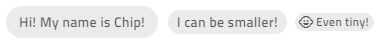
<igx-chip>Hi! My name is Chip!</igx-chip>

<igx-chip style="--ig-size: var(--ig-size-medium)">
  I can be smaller!
</igx-chip>

<igx-chip style="--ig-size: var(--ig-size-small)">
  <igx-icon igxPrefix>child_care</igx-icon>
  Even tiny!
</igx-chip>
Você pode personalizar usandoselect icon aselectIcon entrada. Ele aceita valores de tipoTemplateRef e sobrescreve o ícone padrão mantendo a mesma funcionalidade.
<igx-chip *ngFor="let chip of chipList" [selectable]="true" [selectIcon]="mySelectIcon">
  <igx-icon igxPrefix>{{chip.icon}}</igx-icon>
  {{chip.text}}
</igx-chip>

<ng-template #mySelectIcon>
  <igx-icon>check_circle</igx-icon>
</ng-template>
Você pode personalizar usandoremove icon aremoveIcon entrada. Ele pega um valor de typeTemplateRef e o renderiza em vez do ícone padrão de remover.
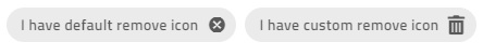
<igx-chip *ngFor="let chip of chipList" [removable]="true" [removeIcon]="myRemoveIcon">
  <igx-icon igxPrefix>{{chip.icon}}</igx-icon>
  {{chip.text}}
</igx-chip>

<ng-template #myRemoveIcon>
  <igx-icon>delete</igx-icon>
</ng-template>
Demo
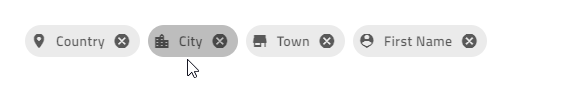
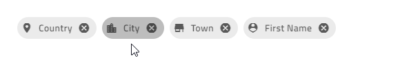
Para criar o exemplo de demonstração abaixo, usaremos os recursos acima:
<igx-chip
*ngFor="let chip of chipList"
[id]="chip.id"
[selectable]="true"
[removable]="true"
(remove)="chipRemoved($event)"
>
    <igx-icon igxPrefix>{{chip.icon}}</igx-icon>
    {{chip.text}}
</igx-chip>
Então, precisamos adicionar achipList função e que lida com oremove evento:
import { IBaseChipEventArgs } from 'igniteui-angular/chips';
// import { IBaseChipEventArgs } from '@infragistics/igniteui-angular'; for licensed package
...
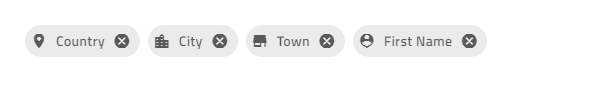
public chipList = [
{
text: 'Country',
id: '1',
icon: 'place'
},
{
text: 'City',
id: '2',
icon: 'location_city'
},
{
text: 'Town',
id: '3',
icon: 'store'
},
{
text: 'First Name',
id: '4',
icon: 'person_pin'
}
];
private changeDetectionRef: any;
public chipRemoved(event: IBaseChipEventArgs) {
this.chipList = this.chipList.filter((item) => {
return item.id !== event.owner.id;
});
this.changeDetectionRef.detectChanges();
}
Se tudo correr bem, você deverá ver isto no seu navegador:
Chip Area
OIgxChipsAreaComponent é usado ao lidar com cenários mais complexos que exigem interação entre chips (arrastar, seleção, navegação, etc.).
Reorder Chips

O chip pode ser arrastado pelo usuário final para alterar sua posição. O arrastar está desativado por padrão, mas pode ser ativado usando adraggable propriedade de entrada. Você precisa cuidar da reordenação dos chips manualmente. É aí que a área do chip é útil, pois ela fornece oreorder evento que retorna a nova ordem quando um chip é arrastado sobre outro.
<igx-chips-area (reorder)="chipsOrderChanged($event)">
  <igx-chip *ngFor="let chip of chipList" [draggable]="'true'">
    <igx-icon igxPrefix>{{chip.icon}}</igx-icon>
    {{chip.text}}
  </igx-chip>
</igx-chips-area>
public chipsOrderChanged(event: IChipsAreaReorderEventArgs) {
    const newChipList = [];
    for (const chip of event.chipsArray) {
        const chipItem = this.chipList.filter((item) => {
            return item.id === chip.id;
        })[0];
        newChipList.push(chipItem);
    }
    this.chipList = newChipList;
}
Keyboard Navigation
O chip pode ser focado usando aTab chave ou clicando nela. Quando os chips estão em uma área de chip, eles podem ser reordenados usando navegação por teclado:
Controles do teclado quando o chip está em foco:
ESQUERDA- Move o foco para o chip à esquerda.
DIREITA- Move o foco para o chip à direita.
ESPAÇO- Alterna a seleção de chip, se possível.
DELETE- Dispara o
removeevento para queigxChipa exclusão do chip possa ser gerenciada manualmente.SHIFT + LEFT- Aciona
reordero evento quandoigxChipAreao chip atualmente focado deve se posicionar para a esquerda.SHIFT + RIGHT- Aciona
reordero evento quandoigxChipAreao chip focado deve se mover uma posição para a direita.
Controles do teclado quando o botão Remover está em foco:
- SPACE ou ENTER Dispara a
removesaída para que a exclusão do chip possa ser feita manualmente.
- SPACE ou ENTER Dispara a
Aqui está um exemplo da área de chips usando IgxAvatar como prefixo e ícones personalizados para todos os chips:
<igx-chips-area (reorder)="chipsOrderChanged($event)">
  <igx-chip
    *ngFor="let chip of chipList"
    [id]="chip.id"
    [selectable]="true"
    [selectIcon]="mySelectIcon"
    [removable]="true"
    [removeIcon]="myRemoveIcon"
    (remove)="chipRemoved($event)"
    [draggable]="'true'">
    <igx-avatar
      class="chip-avatar-resized"
      igxPrefix
      [src]="chip.photo"
      shape="circle">
    </igx-avatar>
    {{chip.name}}
  </igx-chip>
</igx-chips-area>

<ng-template #mySelectIcon>
  <igx-icon>check_circle</igx-icon>
</ng-template>

<ng-template #myRemoveIcon>
  <igx-icon>delete</igx-icon>
</ng-template>
Redimensione o avatar para caber no chip:
.chip-avatar-resized {
  width: 2em;
  height: 2em;
  min-width: 2em;
}
Adicione aschipList funções e que gerenciam os eventos:
import { IBaseChipEventArgs, IChipsAreaReorderEventArgs } from 'igniteui-angular/chips';
// import { IBaseChipEventArgs, IChipsAreaReorderEventArgs } from '@infragistics/igniteui-angular'; for licensed package

...
public chipList = [
    {
        id: '770-504-2217',
        name: 'Terrance Orta',
        photo: 'https://pt-br.infragistics.com/angular-demos/assets/images/men/27.jpg'
    },
    {
        id: '423-676-2869',
        name: 'Richard Mahoney',
        photo: 'https://pt-br.infragistics.com/angular-demos/assets/images/men/13.jpg'
    },
    {
        id: '859-496-2817',
        name: 'Donna Price',
        photo: 'https://pt-br.infragistics.com/angular-demos/assets/images/women/50.jpg'
    }
];

private changeDetectionRef: any;

public chipRemoved(event: IBaseChipEventArgs) {
    this.chipList = this.chipList.filter((item) => {
        return item.id !== event.owner.id;
    });
    this.changeDetectionRef.detectChanges();
}

public chipsOrderChanged(event: IChipsAreaReorderEventArgs) {
    const newChipList = [];
    for (const chip of event.chipsArray) {
        const chipItem = this.chipList.filter((item) => {
            return item.id === chip.id;
        })[0];
        newChipList.push(chipItem);
    }
    this.chipList = newChipList;
}
Se tudo estiver configurado corretamente, você deverá ver isto no seu navegador:
Demo
Estilização
Chip Theme Property Map
Quando você modifica uma propriedade primária, todas as propriedades dependentes relacionadas são atualizadas automaticamente:
| Propriedade primária | Propriedade dependente | Descrição |
|---|---|---|
$background |
$text-cor | A cor do texto do chip. |
| $border cor | A cor da borda do chip. | |
| $hover-contexto | O chip paira na cor de fundo. | |
| $hover-cor-borda | A cor da borda do chip paira. | |
| $hover-cor-texto | O chip paira cor do texto. | |
| $focus-contexto | A cor de fundo do foco do chip. | |
| $selected-contexto | O chip selecionou a cor de fundo. | |
$focus-contexto |
$focus-cor-texto | A cor de foco do texto do chip. |
| $focus-cor da borda | A cor da borda do foco do chip. | |
| $focus-outline-color (apenas variantes bootstrap e índigo) | A cor do contorno do foco do chip. | |
$selected-contexto |
$selected-cor-texto | A cor do texto do chip selecionada. |
| $selected-cor-borda | A cor selecionada da borda do chip. | |
| $hover-selecionado-fundo | O chip selecionado passa a cor de fundo do lugar. | |
$hover-selecionado-fundo |
$hover-texto-selecionado-color- | O chip selecionado passou a cor do texto do curso. |
| $hover-cor-borda-selecionada | O chip selecionado paira na cor da borda. | |
| $focus-selecionado-fundo | A cor de fundo de foco do chip selecionada. | |
$focus-selecionado-fundo |
$focus-cor-texto-selecionado | O texto do chip selecionado foca a cor. |
| $focus-selecionada-cor-borda- | A cor da borda de foco do chip selecionada. | |
| $focus-selecionada-outline-color (apenas variantes bootstrap e índigo) | O chip foca a cor do contorno no estado selecionado. |
Para começar a estilizar o chip, precisamos importar oindex arquivo, onde todas as funções de tema e mixins de componentes estão ativos:
@use "igniteui-angular/theming" as *;

// IMPORTANT: Prior to Ignite UI for Angular version 13 use:
// @import '~igniteui-angular/lib/core/styles/themes/index';
Seguindo a abordagem mais simples, criamos um novo tema que estende echip-theme aceita alguns parâmetros que estilizam os itens do chip. Ao especificar o$background ou o,$selected-background o tema calcula automaticamente as cores de estado apropriadas e os primeiros planos contrastantes. Você ainda pode sobrescrever qualquer outro parâmetro com valores personalizados conforme necessário.
$custom-chip-theme: chip-theme(
    $background: #57a5cd,
    $selected-background: #ecaa53,
    $remove-icon-color: #d81414,
    $border-radius: 5px,
);
Por fim, inclua o tema personalizado em seu aplicativo:
:host {
  @include tokens($custom-chip-theme);
}
No exemplo abaixo, você pode ver como usar o componente do chip com variáveis CSS personalizadas permite criar um design que visualmente se assemelha ao chip usado noAnt sistema de projeto.
Styling with Tailwind
Você pode estilizar o chip usando nossas classes utilitárias personalizadas Tailwind. Certifique-se de configurar o Tailwind primeiro.
Junto com a importação de vento de cauda em sua folha de estilo global, você pode aplicar os utilitários de tema desejados da seguinte maneira:
@import "tailwindcss";
...
@use 'igniteui-theming/tailwind/utilities/material.css';
O arquivo utilitário inclui tantolight as variantes quantodark as do tema.
- Use
light-*as aulas para o tema da luz. - Use
dark-*classes para o tema sombrio. - Adicione o nome do componente após o prefixo, por exemplo,
light-chip,dark-chip.
Uma vez aplicadas, essas classes possibilitam cálculos dinâmicos de temas. A partir daí, você pode sobrescrever as variáveis CSS geradas usandoarbitrary properties. Após os dois-pos, forneça qualquer formato de cor CSS válido (HEX, variável CSS, RGB, etc.).
Você pode encontrar a lista completa de propriedades no tema do chip. A sintaxe é a seguinte:
<igx-chip
  class="!light-chip
  ![--background:#99BAA6]
  ![--remove-icon-color:#C92828]"
  ...
>
  {{chip.text}}
</igx-chip>
Note
O ponto de exclamação(!) é necessário para garantir que a classe utilitária tenha prioridade. O Tailwind aplica estilos em camadas e, sem marcar esses estilos como importantes, eles serão substituídos pelo tema padrão do componente.
No final, seus chips devem ficar assim:
Custom sizing
Você pode usar a--size variável, direcionando diretamente oigx-chip seguinte:
igx-chip {
  --size: 50px;
}
Ou você pode usar a variável universal--ig-chip-size para direcionar todas as instâncias:
<div class="my-app">
  <igx-chip></igx-chip>
</div>
.my-app {
  --ig-chip-size: 50px;
}
Você também pode usar um dos tamanhos predefinidos, atribuindo-o à--ig-size variável. Os valores disponíveis para--ig-size são--ig-size-small,--ig-size-medium, e--ig-size-large:
igx-chip {
  --ig-size: var(--ig-size-small);
}
Saiba mais sobre isso no artigo Tamanho.
API
Theming Dependencies
References
Nossa comunidade é ativa e sempre acolhedora para novas ideias. GitHub