Criando painéis com facilidade usando o bloco do painel
Estamos extremamente entusiasmados em apresentar uma nova funcionalidade de gráficos – Dashboard Tile. Saiba como usar esse recurso de gráficos para criar painéis interativos com quase nenhuma codificação manual.
 Graham Murray
7min read
Graham Murray
7min read
Introdução
This release, Infragistics has a new and exciting charting feature to reveal. We call it the DashboardTile and its purpose is to present a dynamic visualization that the end user can alter at runtime via its various toolbar actions. It is available now as a Preview for Ignite UI For Angular/React/WebComponents/Blazor and Ultimate UI for WPF (and more platforms to come).
Motivação
Na Infragistics, geralmente organizamos nossos componentes para serem extremamente modulares. Uma experiência completa de gráficos pode envolver vários componentes diferentes para configurar/conectar, incluindo: Gráfico, Legenda, Barra de ferramentas, ZoomSlider, Rótulos, Configurações, etc. Um usuário pode querer que eles sejam configurados e dispostos de uma maneira, enquanto outro usuário pode querer que eles sejam configurados e dispostos de uma maneira totalmente diferente, por isso é útil para nós que esses componentes sejam separados, mas conectados, e possam ser colocados no layout do usuário a seu critério e configurados individualmente.
No entanto, isso pode resultar em uma quantidade detalhada de configuração para concluir tarefas simples, e o grau em que permitimos que o usuário configure os componentes pode ser assustador. Para tornar as coisas mais desafiadoras, obter layouts de visualização de dados esteticamente agradáveis pode ser um desafio na web, especialmente para aqueles menos experientes com a plataforma. Além disso, uma grande parte dos usuários pode querer uma configuração razoavelmente direta dos componentes.
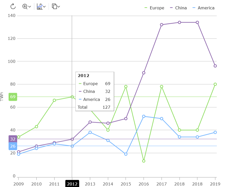
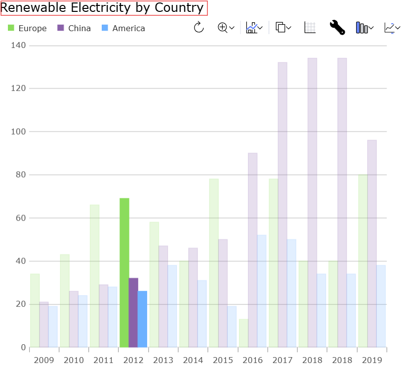
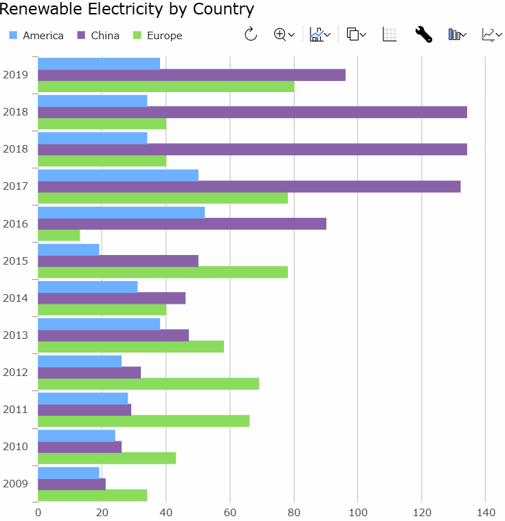
Por exemplo, essa é uma maneira bastante comum de querer que uma visualização pareça:
E para produzir esse efeito, este html foi necessário:
<!DOCTYPE html>
<html>
    <head>
        <title>Sample | Ignite UI | Web Components | infragistics</title>
        <meta charset="UTF-8" />

        <link rel="stylesheet"
        href="/src/index.css"
        type="text/css" />
    </head>

    <body>
        <div id="root">
            <div class="container sample">
                <div class="aboveContentSplit">
                    <div
                    class="aboveContentLeftContainer">
                        <igc-toolbar
                        name="toolbar"
                        id="toolbar"
                        orientation="Horizontal">
                        </igc-toolbar>
                    </div>
                    <div
                    class="aboveContentRightContainer">
                        <igc-legend
                        name="legend"
                        id="legend"
                        orientation="Horizontal">
                        </igc-legend>
                    </div>
                </div>

                <div class="container fill">
                    <igc-category-chart name="chart"
                    id="chart"
                    chart-type="Line"
                    is-horizontal-zoom-enabled="true"
                    is-vertical-zoom-enabled="true"
                    included-properties="year, europe, china, america"
                    y-axis-title="TWh"
                    is-transition-in-enabled="true">
                    </igc-category-chart>
                </div>
            </div>
        </div>
    </body>
</html>
E este css:
.aboveContentSplit {
    display: flex;
    flex-direction: row;
}
.aboveContentLeftContainer {
    margin-left: 1.25rem;
    display: flex;
    flex-grow: 1;
    justify-content: flex-start;
    align-items: flex-end;
}
.aboveContentRightContainer {
    margin-right: 1.25rem;
    display: flex;
    flex-grow: 1;
    justify-content: flex-end;
    align-items: flex-end;
}

html,
body,
#root {
    margin: 0px;
    height: 100%;
}

.container {
    display: flex;
    flex-flow: column;
    flex-wrap: nowrap;
    align-items: stretch;
    align-self: stretch;
    /* min-width: 200px; */
    height: 100%;
    width: 100%;
    padding: 0px;
    margin: 0px;
    box-sizing: border-box;
}

.fill > * {
    height: 100%;
}
e os componentes precisavam ser configurados em código assim:
import {
    IgcLegendModule,
    IgcCategoryChartModule,
    IgcCategoryChartToolbarModule }
    from "igniteui-webcomponents-charts";
import { IgcToolbarModule } from "igniteui-webcomponents-layouts";
import {
    IgcLegendComponent,
    IgcCategoryChartComponent
    }
    from "igniteui-webcomponents-charts";
import { IgcToolbarComponent } from "igniteui-webcomponents-layouts";
import { CountryRenewableElectricity } from "./CountryRenewableElectricity";
import { ModuleManager } from "igniteui-webcomponents-core";

import "./index.css";

ModuleManager.register(
    IgcLegendModule,
    IgcToolbarModule,
    IgcCategoryChartModule,
    IgcCategoryChartToolbarModule);

var legend = document.getElementById("legend") as IgcLegendComponent;
var toolbar = document.getElementById("toolbar") as IgcToolbarComponent;
var chart = document.getElementById("chart") as IgcCategoryChartComponent;

toolbar.target = chart;
chart.dataSource = new CountryRenewableElectricity();
chart.legend = legend;
In response, DashboardTile is meant to present a common set of components for the provided data with zero or next to zero configuration, and all laid out in an aesthetically pleasing way.
Além disso, como a Infragistics está assumindo maior controle sobre a integração de todos os componentes, aproveitamos a oportunidade para criar um cenário de bloco de painel editável em que o usuário final pode ajustar como a visualização é apresentada com base em vários menus disponibilizados. O objetivo é facilitar a criação de painéis dinâmicos em seus aplicativos.
By comparison, the above scenario can be created with DashboardTile with this html:
<!DOCTYPE html>
<html>
    <head>
        <title>Sample | Ignite UI | Web Components | infragistics</title>
        <meta charset="UTF-8" />

        <link rel="stylesheet"
        href="/src/index.css"
        type="text/css" />
    </head>

    <body>
        <igc-dashboard-tile
            id="tile"
            tile-title="Renewable Electricity by Country"
            width="100%"
            height="100%">
        </igc-dashboard-tile>
    </body>
</html>
e este css:
html,
body {
    margin: 0px;
    height: 100%;
}
e este código:
import { CountryRenewableElectricity } from "./CountryRenewableElectricity";
import { ModuleManager } from "igniteui-webcomponents-core";
import {
    IgcDashboardTileComponent,
    IgcDashboardTileModule,
    IgcDataChartDashboardTileModule,
    IgcGeographicMapDashboardTileModule,
    IgcLinearGaugeDashboardTileModule,
    IgcPieChartDashboardTileModule,
    IgcRadialGaugeDashboardTileModule
} from "igniteui-webcomponents-dashboards";
import "./index.css";

ModuleManager.register(
    IgcDashboardTileModule,
    IgcDataChartDashboardTileModule,
    IgcPieChartDashboardTileModule,
    IgcGeographicMapDashboardTileModule,
    IgcRadialGaugeDashboardTileModule,
    IgcLinearGaugeDashboardTileModule);

var tile = document.getElementById("tile") as IgcDashboardTileComponent;
tile.dataSource = new CountryRenewableElectricity();
But the truly awesome part is that the DashboardTile version of the scenario is much more dynamic than the version that used CategoryChart.
Anatomia do bloco do painel
DashboardTile tem um título integrado:
which you can set via the tileTitle.
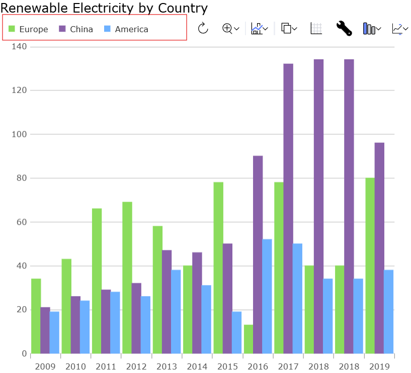
DashboardTile tem uma legenda integrada que é configurada automaticamente para exibir itens do gráfico associado, o que for:
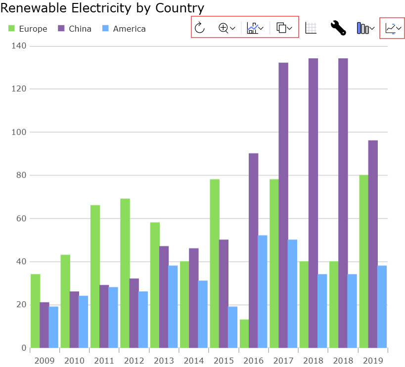
DashboardTile apresenta uma barra de ferramentas que apresenta um conjunto semelhante de comandos em comparação com o gráfico de categorias:
But there are additionally several other actions that are specific to DashboardTile.
If you click the grid action, it shows a grid containing the data that is bound to the DashboardTile. Selection state is synchronized between the grid and the chart.

Se você clicar na ação do editor, ela mostrará um editor com configurações contextuais para a visualização exibida no momento, que permitem que o usuário final modifique a visualização de acordo com sua preferência.
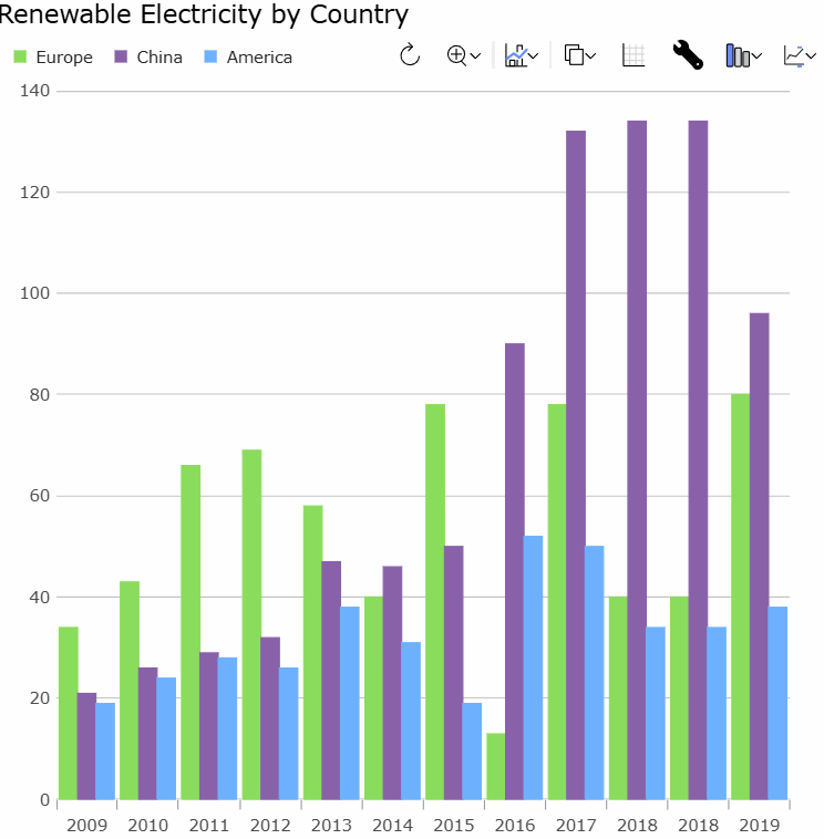
When the DashboardTile initially displays it gives its best guess as to which visualization to show you (more on that later). If it was incorrect, though, or if you’d like to compare with other ways to visualize the data you can use the chart type action on the toolbar:
If you bind the DashboardTile to a LocalDataSource the grouping/summary state is even synchronized between the grid and the chart, so that changes to the grid aggregation are propagated to the chart.
Visualização automática
Apart from making it easier to lay out and configure a data visualization scenario, and letting the end user modify things are runtime, the DashboardTile also helps you automatically render a useful visualization with no configuration.
Isso é útil para facilitar a realização de mais com menos código, mas também ajuda se o aplicativo tiver dados muito dinâmicos e você não puder necessariamente prever qual visualização usar no momento da compilação.
DashboardTile usa uma biblioteca de heurísticas para tentar determinar a visualização mais apropriada a ser exibida. Aqui estão alguns exemplos:
- If you provide a single value,
DashboardTileis likely to present you with aLinearGaugeorRadialGauge. - If you provide a small number of values that are easy to distinguish from one another,
DashboardTileis likely to present you with aPieChart. - If you provide a small number of values that are difficult to compare precisely
DashboardTilewill avoid aPieChartand instead present you with a column chart. - If you have more values than make sense for a column chart,
DashboardTilewill tend to show you a line chart. - If your data appears to be scatter values,
DashboardTilewill tend to show you a scatter chart. - If your scatter data seems to be geographic coordinates,
DashboardTilemay choose to plot these on a map rather than a chart. - Se seus dados parecerem ter formas geométricas, elas poderão ser plotadas em um gráfico ou mapa.
- If your data appears to be stock data,
DashboardTilemay chose to show a candlestick or OHLC plot. - If
DashboardTile‘s heuristics are fooled, you can always set the desired chart type via thechartTypeproperty, or modify the chart type via the toolbar chart type action.
Conclusion
DashboardTile é um novo recurso de gráfico empolgante que agora lançamos como uma visualização. Agradecemos seus comentários para que possamos fazer mais melhorias antes do lançamento final.