Novidades: Ignite UI for Angular 24.1
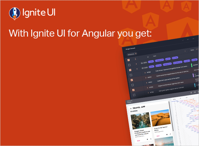
A versão mais recente do Ignite UI foi lançada e traz toneladas de novos recursos e componentes para Angular. Saiba mais sobre as atualizações e experimente os novos recursos.
 Radoslav Mirchev
4min read
Radoslav Mirchev
4min read
É hora de lançamento e, com as atualizações mais recentes do Ignite UI for Angular nos últimos meses, introduzimos um amplo conjunto de novos recursos e aprimoramentos projetados para simplificar e melhorar a experiência de criação de aplicativos para desenvolvedores da Web.
Essa atualização contínua abrange desde grandes aprimoramentos na maneira como os usuários visualizam dados até otimizações de desempenho, novos componentes e muito mais. Mas quais são os principais destaques? Vamos explorar todos eles.
Version 17.1
Registro de alterações 17.1
Melhoria na agitação da árvore de pacotes
A agitação da árvore é crucial para Angular bibliotecas de componentes porque ajuda a otimizar o tamanho final do pacote removendo o código não utilizado. Ao eliminar o código não utilizado, o tree-shaking reduz a quantidade de JavaScript que precisa ser baixado e executado pelo navegador. Isso leva a tempos de carregamento mais rápidos e a uma melhor experiência do usuário. Aqui estão alguns dos benefícios da agitação aprimorada da árvore de pacotes:
- Desempenho aprimorado
- Efficient Resource Utilization
- Simplified Codebase
- Enhanced Security
New: Icon Button
A Ignite UI para Angular diretiva Icon Button destina-se a transformar qualquer ícone em um botão totalmente funcional. O igxIconButton vem em três tipos - plano, delineado e contido, que é o padrão.
Version 17.2
Changelog 17.2
Atualizações de calendário – estilo e temas
Ignite UI aparência do calendário foi atualizada para melhorar a experiência do usuário e atender ao feedback do cliente. O componente Ignite UI for Angular Calendário, desenvolvido como um componente Angular nativo, fornece maneiras fáceis e intuitivas de exibir informações de data, ativar datas ou aplicar Angular modo de desativação de datas de calendário. Os usuários podem escolher entre três modos de seleção diferentes – seleção única, seleção múltipla ou seleção de intervalo.

Button improvements

Suporte para conjuntos de ícones externos
Agora, parte ou todos os ícones usados por Ignite UI for Angular componentes podem ser substituídos por um conjunto de ícones não materiais. O Ignite UI Icon Service torna mais fácil para os desenvolvedores incluir imagens SVG personalizadas e usá-las com IgxIconComponent. Além disso, ele pode ser usado para associar uma classe personalizada a ser aplicada em IgxIconComponent de acordo com a família de fontes fornecida.
Atualizações de formatos de editor de data, data e hora
Version 18.0
Changelog 18.0
Support of Angular 18
Modelo de cabeçalho para a grade dinâmica
A partir da versão 18.0.0, os cabeçalhos de valor de dimensão de linha Ignite UI for Angular podem ser habilitados por meio pivotUI da opção.
Expor cabeçalhos para que as dimensões de linha fiquem visíveis no Excel ao exportar uma grade dinâmica
Deprecate of ‘displayDensity’ property
Version 18.1
Changelog 18.1
Expansão da dimensão da linha horizontal para a grade dinâmica
Foco de cabeçalhos e navegação por teclado para cabeçalhos de dimensão de linha de grade dinâmica
Exemplo de modelo de cabeçalho e expansão de dimensão de linha horizontal para a grade dinâmica:

Grid Toolbar updates

Complete CHANGELOGS:
Ignite UI for Angular 17.1
Ignite UI for Angular 17.2
Ignite UI for Angular 18.0
Ignite UI for Angular 18.1
Para encerrar tudo...
Perfeitamente criado para compatibilidade, Ignite UI for Angular é a biblioteca que permite aproveitar o poder das tecnologias mais recentes e dos principais lançamentos. Comprometidos em fornecer a você o melhor kit de ferramentas de interface do usuário Angular e insights relacionados, nosso objetivo é equipá-lo com mais know-how, novos recursos, desempenho aprimorado e estabilidade aprimorada. Algumas das melhorias foram adicionadas graças às solicitações de usuários como você por meio de nosso repositório Ignite UI for Angular GitHub. Com isso em mente, estamos sempre abertos a sugestões e feedbacks – isso nos faz crescer e responder melhor às suas necessidades de desenvolvimento.
Se precisar de mais detalhes, recomendamos que você confira nosso:
Além disso
Siga-Ignite UI for Angular no Medium para se manter atualizado e saber mais sobre os últimos projetos relacionados à Angular em que estamos trabalhando. Dê-nos uma estrela no GitHub e ajude-nos a continuar melhorando nosso produto, abordando quaisquer preocupações, perguntas ou solicitações de recursos na seção de problemas.