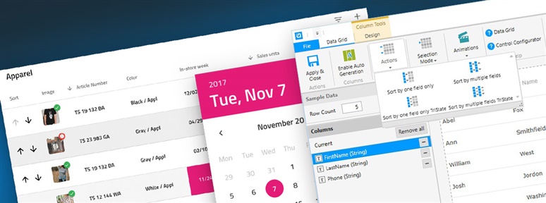
It has been a while since the introduction of the new ASP.NET controls based on the Aikido framework. It brought the developers a product meeting latest standards in performance and modern browser support. This turned into a major challenge for applications that need to migrate from the Ultra ASP.NET controls to the new Aikido control.
Infragistics Blog
If you're unfamiliar with IRC (Internet Relay Chat) it is an application layer protocol used to facilitate chat with users all over the globe and has been around since the late 1980s and is still widely used to this day.
The idea of using a honeypot to learn about potential attackers came to me while chatting with a friend that had exposed his SSH port to log into while away from home.
This post is in continuation of my previous post where we discussed the needs, basics, configurations and transport mechanism of SignalR. In this post we will take this a step further by creating a sample application and analyze it further.
The Repository Pattern is one of the most popular patterns to create an enterprise level application. It restricts us to work directly with the data in the application and creates new layers for database operations, business logic, and the application’s UI.
In ASP.NET MVC, Filters are used to inject logic at different levels of request processing and allow us to share logics across Controllers. Learn more.
A brief overview on passing dependencies in AngularJS using the function argument, array arguments, and the $inject service.
In this post, we will cover various aspects of the Bootstrap Grid system with various examples. To start with let us create a four equal column layout for medium-sized devices in Bootstrap Grid system.
The provider() function allows us to create a configurable service where we can set input per application for the service created using the provider ().
So, what is UI Automation testing? Well, let's start off with breaking it down, UI or User Interface, is the front end of your application that your users interact with on their screens.


